Study guide made in class is here.
The test will consist of artwork ID's, an 'unknown' slide, in which you use formal analysis to decide which culture the piece came from, short answer/multiple choice, and a Synthetic Writing Piece in which you bring together formal analysis, your knowledge of the culture/history, and interpretive work. This post contains examples of some past test answers.
Menkaure and His Wife, Queen Khamerenebty
Artist Unknown
2500 BCE
Giza, Egypt; Dynasty 4
Shows the strength and unity of the rulers through their unity (carved from a single block of stone, the Queen's embrace) and symmetry (same height of all body parts, her hair mimics his headdress). Both depicted as youthful and idealistically beautiful. This one needs a great deal more detail and historical context!
here's more from a test a few years' back;
Relief of Akhenaten and His Family, artist unknown, c. 1348-1364/5 B.C.E. Dynasty 18.
This relief shows the king and queen of the now unified Egypt. We can see that it is a unified nation due to the stylized papyrus and lotus leaves. We also can see the diagonal lines coming from Aten (the circle represented in this relief) meaning that the god is giving a blessing to the royal couple as well as the fact that the line/ rays are ending in ankhs symbolizing everlasting life. In better terms Aten was wishing them everlasting life. The piece is very balanced with the king and queen being the same size meaning the same power; they have an equal amount of the blessing. The age difference in their children is also depicted, 2 seem to be a lot older than the infant. Looking closely at the hieroglyphics around the figures there are cartouches of the royal family and possibly of their lineage. There is beautiful detail in the figures as well; Nefertiti looks to be youthful and you can even see her bone structures in her collar bone area and cheeks, while Akhenaten is older with what looks to be brittle bones, wrinkles, and veins popping out.
The test will consist of artwork ID's, an 'unknown' slide, in which you use formal analysis to decide which culture the piece came from, short answer/multiple choice, and a Synthetic Writing Piece in which you bring together formal analysis, your knowledge of the culture/history, and interpretive work. This post contains examples of some past test answers.
 |
Palette of Narmer, 3000-2920 bce, slate, 2'1"
The Palate of Namar which was created around 3150-3125 BCE. This is one of the first examples of Egyptian style art work and the first representation of social ranking. By showing social ranking on this piece they used size/scale to show the difference between the important and not so important people (bigger people being higher of social rank). This piece was created after Narmar conquered lower Egypt. It was created to show his great strength and gave honor to his ruling. His ruling of a new area created chaos. This piece provides historical context of culture and gave a good representation of useful objects. It was a propaganda piece of telling the story of King Namar.
|
 |
| Great Pyramids of Giza, 2560-2510 bce; Menkaure, Khufu, Khafre
Piece: The Great Pyramids
Timeline: 2,601-2,515 B.C.E.
Era: Dynasty 4, Egyptian
Artist: Unknown
Analysis: The pyramids possess a strong vertical direction. It's very balanced compositionally, and has a common thread connection with the number three (three sides, three pyramids). The vertical lines come to a singular point at the top. The horizontal texture across the pyramids indicate that they have been weathered, however still withstood time.
Historical Context/Significance: The strong vertical direction represents a connection to religion; the pyramids are reaching up toward the sky, reaching up towards the gods. The stable, massive forms also indicate permanence, immutability! The pyramids were used as burial sites, so that in the afterlife the kings that were buried there could continue living as they did before. The number of pyramids is also socially/politically significant(what does the #3 signify in Egypt?); each pyramid was created for a king who ruled; Khufu, Hemiunu, and Imhotep. They are symbols of power and influence in society, the pyramids stand strong against the outside surroundings. They appear minimalistic, however possess not only complex, mazelike passage ways, but also various beautiful pieces of artwork.
|
 |
| Menkaure and Khamerernebty, greywacke stone, ~2475 bce |
Artist Unknown
2500 BCE
Giza, Egypt; Dynasty 4
Shows the strength and unity of the rulers through their unity (carved from a single block of stone, the Queen's embrace) and symmetry (same height of all body parts, her hair mimics his headdress). Both depicted as youthful and idealistically beautiful. This one needs a great deal more detail and historical context!
here's more from a test a few years' back;
The pose of Menkaure and Khamerernebty represents the traditional qualities of Ancient Egyptian Statues and paintings.
Both King and his queen stand upright with one foot forward. Their body proportions are perfect. The queen is almost as tall as the king but she stands a little bit hehind him, supporting his shoulders.
The statue has a very official look. It was also found in Giza.
The pose emphasizes the strength and stability, readiness even. It shows the close connection of the husband and wife. They both look in the same direction, showing they both pursue the same goal.
Similar size shows the close equality of their power, maybe even dependence on one another.
 |
| Funerary Temple of Hatshepsut, ~1460 bce
The Funerary Temple of Hatshepsut
Dy. 18, 1478 bce
Ancient Egypt.
Hatshepsut's Funerary Temple is historically significant due to its extravagance & well-preserved representation of Egyptian culture at the time. Politically , Egypt was experiencing a time of prosperity, allowing them to take on extensive building projects. The temple acted not only as a funerary temple, but also a commemorative tribute to favorite gods. MORE!!!! what does it say about power, about the status of the pharoah, about the relationship of egyptian art to other art of the ancient world?
|
 |
| Colossal Statue of Akhenaten, ~1350 bce Tahtiana, Brett, Lauren 18th Dynasty Pharaoh
Significance is that it differs from most Egyptian art of the “classic” Pharaoh. His body is more feminine and he has a larger belly. He wears traditional garb, a shenti, the crook and flail as well as beard of Pharaoh, the Double Crown of Egypt to show it was unified during his reign. Highly detailed in pleats on shenti and the bracelets and symbols. He is 4 meters tall so there is some Hieratic Hierarchy going on because he is much taller than a normal human. Breaks with the traditional image of Pharaoh to actually depict his own features. Similar statue made of Nefertiti where she is also shown in relatively the same size and shape, so they mirror and balance each other.
Possibly a merging of masculine and feminine. (Akhenaten was a complete nutcase- well.... he was unique-- some say a creative and innovative thinker! ). All curvilinear, and there’s a vertical thrust, creating more of an illusion of power. Forcing people standing at the base of the statue to crane their heads back. Reinforces the ideal of Pharaoh also being a God among men.
|
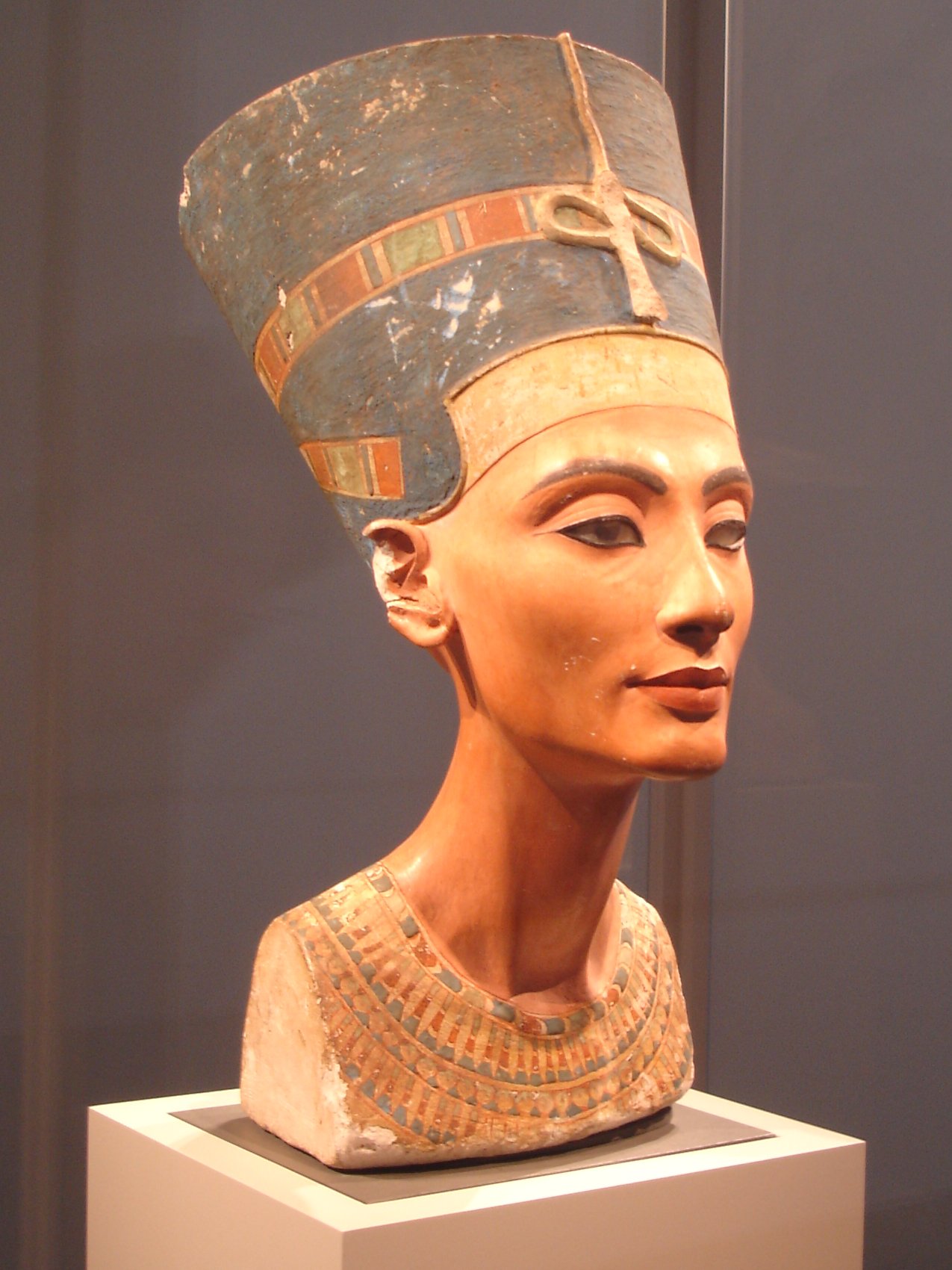 |
| Bust of Nefertiti Formal Analysis Title: Nefertiti Artist: Unknown artist Date: c. 1348-1336/5 BCE. Period: Dynasty 18 Description: Smooth, chiseled features. Saturated hues of blue, green, red, and gold. Refined bone structure. Detailed “jewel” necklace and beautiful head dress show hierarchy and importance. High check bones, distinguished nose, and a thin elegant neck. Significance: Possibly propaganda of the queens beauty, to make it well known that she in fact was the most beautiful in all the land. It could be an absolute replica of her face, but it could also be fabricated to hide all of her imperfections and make her seem naturally beautiful. Also, in that time, many sculptures were of men, so the fact that this is a bust of a very strong and powerful woman, is very significant. She stands tall and her head is arched upwards which gives a feeling of arrogance and high importance. Though it is just a bust, and one of the eyes is unfinished, she still has a beauty and grace that is incomparable. |
 |
| Akhenaten, Nefertiti and Three of their Daughters, House Altar, Sunk Relief, 1350 bce. great source. |
This relief shows the king and queen of the now unified Egypt. We can see that it is a unified nation due to the stylized papyrus and lotus leaves. We also can see the diagonal lines coming from Aten (the circle represented in this relief) meaning that the god is giving a blessing to the royal couple as well as the fact that the line/ rays are ending in ankhs symbolizing everlasting life. In better terms Aten was wishing them everlasting life. The piece is very balanced with the king and queen being the same size meaning the same power; they have an equal amount of the blessing. The age difference in their children is also depicted, 2 seem to be a lot older than the infant. Looking closely at the hieroglyphics around the figures there are cartouches of the royal family and possibly of their lineage. There is beautiful detail in the figures as well; Nefertiti looks to be youthful and you can even see her bone structures in her collar bone area and cheeks, while Akhenaten is older with what looks to be brittle bones, wrinkles, and veins popping out.
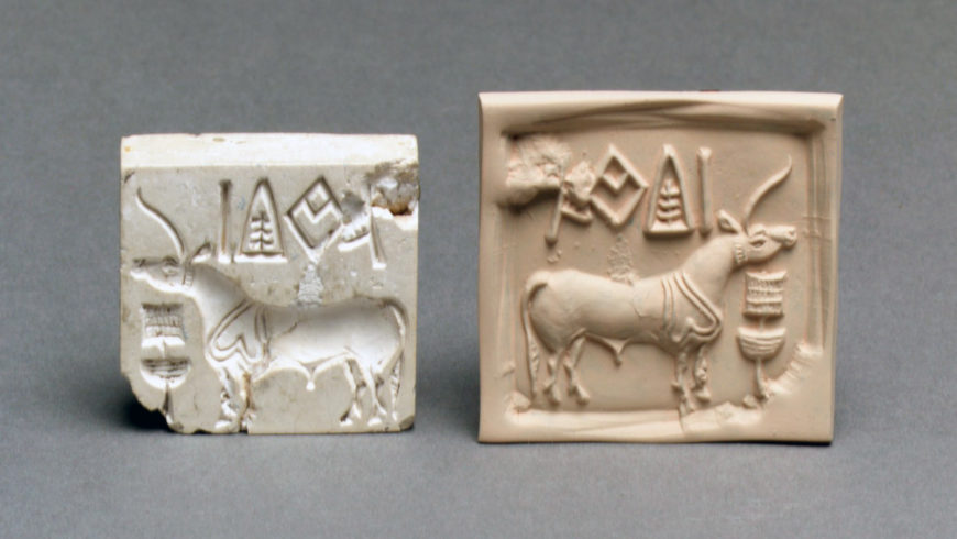
Unknown Artist, Indus River Valley Seal, 2500-1500 bce, indus river valley
This is significant because it is a seal, which indicates that the Indus River Valley was a systematic culture. Seals could have been used to mark documents, perhaps even used for trade. This means that the civilization was somewhat sophisticated and structured. At thhe top, there appears to be writing (although it has not been translated.) This would suggest that the Indus Valley was even more advanced.
Formal Analysis Examples from your Quizzes

Formal Analysis of Woman and Man from Cernavoda, Romania
Both the man and the woman are made out of a smooth, black, shiny material. It looks to me like graphite. The majority of the lines are curved, with rounded edges. However, some of the edges are sharp, creating details. For example, sharp brow lines, strange sharp lines on the woman's bosom (this strikes me as very odd), and usually where one body part is turning into another. The use of the same material and the similar lines in the faces/neck give these figures a sense of unity and harmony.
The man is sitting in an almost pensive position, with his elbows resting on his knees and his head in his hands. This connection/continuation from the head all the way to feet creates a strong vertical line. The chair/stool, back, and neck also create an almost parallel vertical line. The horizontal line of the shoulders and the diagonal lines of the thigh and upper arm give the figure some variety and rhythm, even though, the overall movement is vertical.
The woman is sitting in sort of listening or waiting position. The lines of her shoulders and her broad rounded hips give her a more relaxed horizontal movement. Most of her form is very round and voluptuous in comparison to the man. Her lower body morphs together in a way the man's doesn't. His legs seem rectangular and distinct from his torso while her legs sort of pour out into little triangular stumps. Her arms are almost horizontal, but they are angled slightly downward giving the figure variety and not making it so rigid. The short vertical lines of her bent right leg and neck give her form variety and conversely, unite her form to the man's.


For my formal analysis I am going to examine the last piece of artwork shown, the Cave of Hands.
The first thing that really stood out to me was the sense of direction. At a first glance it has a very strong horizontal direction, all the hands are facing upwards towards the sky, fingers as if they are reaching for something. However, when you look closer (more so around the middle center of the piece as well as along the top) you notice that some of the over lapping hands are vertical, fingers reaching out to the sides, which caused me to wonder if they were intentional from the artist so the piece possessed variety, or if it was done by another artist at a later time. The piece has a very geometric presence. The straight lines of the fingers, the slight angle where the finger meets the palm, it is a very strong aspect. Another thing that is very striking about the piece is the use of color. Majority of the hand outlines are done in a warm tone; rich reds and oranges that stand out against the rock color. However, in certain places (toward the outer corners, and some in the center) the artist(s) used white and black, which stand out against the opposing two colors. I feel that the saturation of the white and black is so significant that it kind of almost mutes the orange and red outlined hands. My eyes kept being drawn to the darker, blacker hand shapes, and I feel like it was acting as a "focal point" that kept drawing my attention in. It's interesting, because when I consider the orange and red colors alone I felt that they were very deep colors, high in saturation, with a deep hue, but when it's next to the black and white it feels knocked back a little. The redder rock tones allow the colored paint to blend in with the texture of the rock. It's interesting because the painting is done on a very textured surface; jagged, rough rock, but when I view the piece it feels very soft, almost delicate. I think that it feels delicate because of the way it was executed, taking the time to lay each hand against the wall, taking time to make sure that you really coated the outside, so that a strong print was left behind, it represents a lot of patience.
Overall, I believe that this piece demonstrates both unity and variety. It has unity because of the similar placement of the hands, all reaching in (mostly) the same direction, done in similar, complimenting colors. Yet it still has a hint of variety; some outlier hands in different directions, hands that are done in lighter or darker paint, some fingers more out stretched then others, some overlapping at different points. There's kind of a graceful balance to it, each outline is clean and crisp, each finger well defined (considering the method), all in unison working together with one of another. There is a good balance of hands in the sense that the overlapping kind of joins them all together, kind of in a communal way, if there was too much space in between them it would look unfinished, and too many prints wouldn't allow you to see all the features. This piece is also a strong example of pattern and repetition, again it's just hand after hand in the similar movements, all around the same size in a seemingly organized way. Although the handprint alone doesn't offer much depth, I felt that by having them touching, and overlapping it brought out a sense of depth to the piece overall. The hands in unison work really well at complimenting each other.
here's another analysis of the cave of the hands that has some of the most vivid descriptive sentences I read!
Formal Analysis of Woman and Man from Cernavoda, Romania
Both the man and the woman are made out of a smooth, black, shiny material. It looks to me like graphite. The majority of the lines are curved, with rounded edges. However, some of the edges are sharp, creating details. For example, sharp brow lines, strange sharp lines on the woman's bosom (this strikes me as very odd), and usually where one body part is turning into another. The use of the same material and the similar lines in the faces/neck give these figures a sense of unity and harmony.
The man is sitting in an almost pensive position, with his elbows resting on his knees and his head in his hands. This connection/continuation from the head all the way to feet creates a strong vertical line. The chair/stool, back, and neck also create an almost parallel vertical line. The horizontal line of the shoulders and the diagonal lines of the thigh and upper arm give the figure some variety and rhythm, even though, the overall movement is vertical.
The woman is sitting in sort of listening or waiting position. The lines of her shoulders and her broad rounded hips give her a more relaxed horizontal movement. Most of her form is very round and voluptuous in comparison to the man. Her lower body morphs together in a way the man's doesn't. His legs seem rectangular and distinct from his torso while her legs sort of pour out into little triangular stumps. Her arms are almost horizontal, but they are angled slightly downward giving the figure variety and not making it so rigid. The short vertical lines of her bent right leg and neck give her form variety and conversely, unite her form to the man's.
Formal Analysis: Mimis and Kangaroo, Australia
The white kangaroo captures the viewers attention first because of it’s size, high value contrast
of the white paint against the muddy background, and the details within the shape of the animal.
Immediately we begin with the head of the kangaroo because of the concentration of detail, and
the eye follows the curvilinear shape forming the kangaroos back all the way down to the tail.
Along the way, the strong sense of repetition in the detailed lines following the curve create a
sense of rhythm, aided by the repetition of the organic line that forms the kangaroos back as
well. From there, the viewer is able to move out of the central shape and notice the nuances of
the background, as well as the other smaller kangaroo that is depicted in the lower left corner.
Because of the low value contrast between the shape and the background, it is hardly
noticeable at first, but the concentrated detail within the shapes helps to grab the viewers
attention. The detail in the small kangaroos back mimics the detail in the larger kangaroos back,
and strengthens the sense of repetition within the composition that was mentioned earlier.
Though most of the activity within the composition is concentrated in the lower left and center,
there is still sense of balance created by the intense details within the background. At first it is
easy to see the large brushstrokes of black, browns, and white that can be described as messy,
brash, and anxious, but upon further notice, it is evident that there are even more figures
perhaps representing human bodies covered by the larger shapes of the kangaroos. The high
energy brushstrokes in the background are contrasted by the organic shapes of the kangaroos
in the foreground, making it look as though there are two different scenes painted on top of one
another. However, there seems to be a pattern throughout the entire composition of the long
organic line with smaller lines attached to it. This is repeated three times in the painting on a
diagonal which creates a sense of energy and movement in the piece. The colors of the painting
are very earthy and natural tones, besides the pure white which creates a very stark contrast
throughout the piece. The lines that separate the shapes from the background aid in this strong
contrast as well.
For my formal analysis I am going to examine the last piece of artwork shown, the Cave of Hands.
The first thing that really stood out to me was the sense of direction. At a first glance it has a very strong horizontal direction, all the hands are facing upwards towards the sky, fingers as if they are reaching for something. However, when you look closer (more so around the middle center of the piece as well as along the top) you notice that some of the over lapping hands are vertical, fingers reaching out to the sides, which caused me to wonder if they were intentional from the artist so the piece possessed variety, or if it was done by another artist at a later time. The piece has a very geometric presence. The straight lines of the fingers, the slight angle where the finger meets the palm, it is a very strong aspect. Another thing that is very striking about the piece is the use of color. Majority of the hand outlines are done in a warm tone; rich reds and oranges that stand out against the rock color. However, in certain places (toward the outer corners, and some in the center) the artist(s) used white and black, which stand out against the opposing two colors. I feel that the saturation of the white and black is so significant that it kind of almost mutes the orange and red outlined hands. My eyes kept being drawn to the darker, blacker hand shapes, and I feel like it was acting as a "focal point" that kept drawing my attention in. It's interesting, because when I consider the orange and red colors alone I felt that they were very deep colors, high in saturation, with a deep hue, but when it's next to the black and white it feels knocked back a little. The redder rock tones allow the colored paint to blend in with the texture of the rock. It's interesting because the painting is done on a very textured surface; jagged, rough rock, but when I view the piece it feels very soft, almost delicate. I think that it feels delicate because of the way it was executed, taking the time to lay each hand against the wall, taking time to make sure that you really coated the outside, so that a strong print was left behind, it represents a lot of patience.
Overall, I believe that this piece demonstrates both unity and variety. It has unity because of the similar placement of the hands, all reaching in (mostly) the same direction, done in similar, complimenting colors. Yet it still has a hint of variety; some outlier hands in different directions, hands that are done in lighter or darker paint, some fingers more out stretched then others, some overlapping at different points. There's kind of a graceful balance to it, each outline is clean and crisp, each finger well defined (considering the method), all in unison working together with one of another. There is a good balance of hands in the sense that the overlapping kind of joins them all together, kind of in a communal way, if there was too much space in between them it would look unfinished, and too many prints wouldn't allow you to see all the features. This piece is also a strong example of pattern and repetition, again it's just hand after hand in the similar movements, all around the same size in a seemingly organized way. Although the handprint alone doesn't offer much depth, I felt that by having them touching, and overlapping it brought out a sense of depth to the piece overall. The hands in unison work really well at complimenting each other.
here's another analysis of the cave of the hands that has some of the most vivid descriptive sentences I read!
Near the upper-left corner, a white handprint is silhouetted by a black, hazy circle; the installment is then contrasted by the tan hue of the coarse cave wall. This is where my eye is drawn to first, most likely because this specific handprint consists of the highly contrasted white and black, and is more isolated from the cluster of handprints than most any other.
Then my focus shifts to the central mass of hand silhouettes—a chaotic bloom of red, white
black and orange. The vertical ascension of the hands is energized by their varying angels. The form of the hands become heavier and more distinct as we follow the upward flow. Nearer the bottom, the
prints are eroded and distorted.
The bottom left portion of the wall, separated by a rigid, orderless, downward moving line and
by its darker value, stands out from the rest of the scene. Its prints melt together into a slurred mesh.
This sloppy, darkened portion of the wall is somewhat balanced by it’s horizontal partner, the brightest portion of the wall, consisting of less and less clutter as we near the right edge, revealing a granulated, sandy-white wall.
The mass of handprints breathes like an organic accident. but its unintelligible pattern makes it
chaotic, perhaps even disturbing. The culmination resembles a desperate and disarranged crowd,
reaching towards the sky, as if for some semblance of hope. Those unfortunate hands stuck at the
bottom will putrefy, trampled by the masses above
***Bust of Nefertiti
Mask of Tutankhamun
***Great Pyramids at Giza
No comments:
Post a Comment